The story at a glance
The microphone looked active. A child still couldn’t tell it was listening.
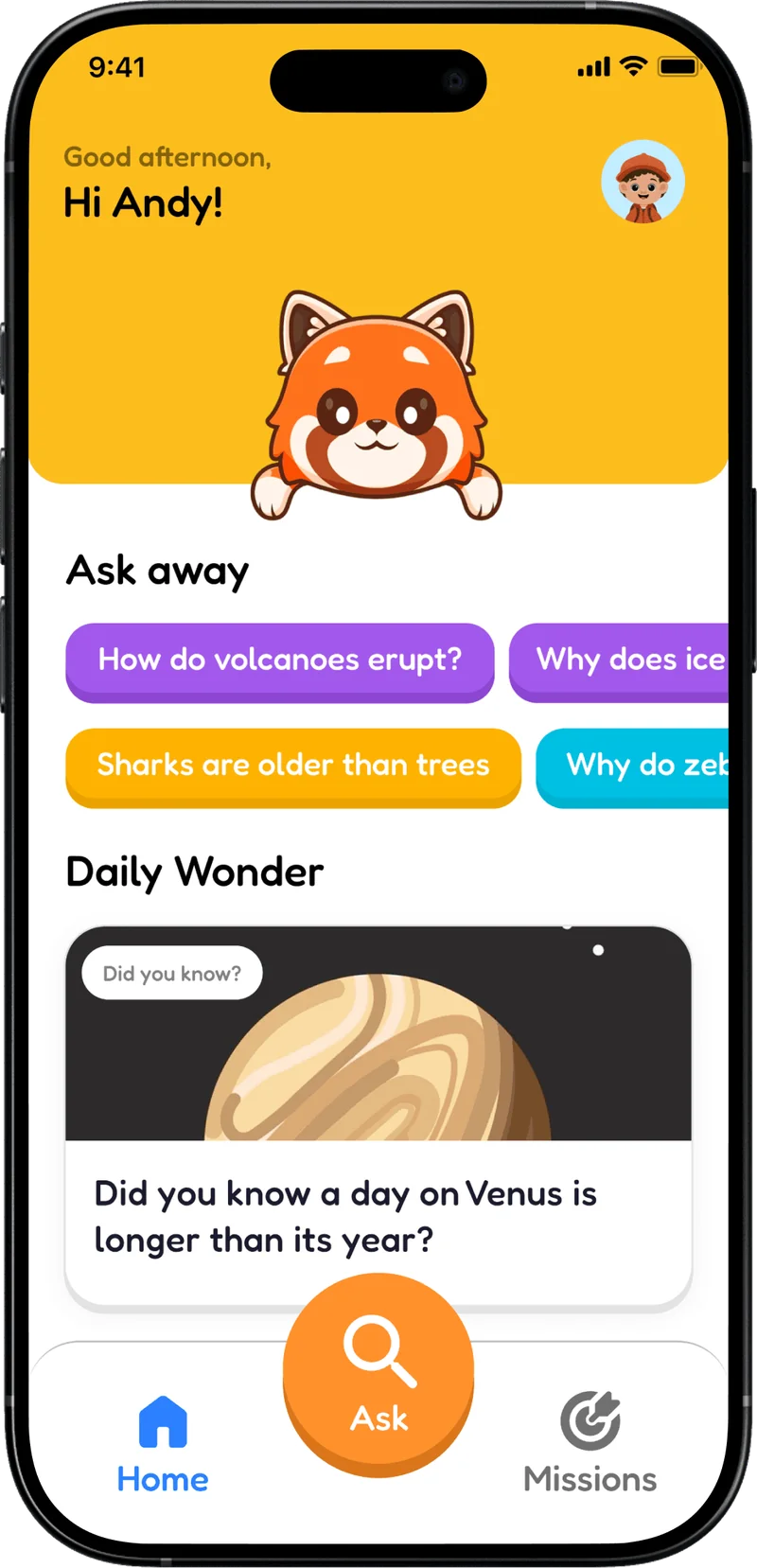
Whylo is a question-and-answer app concept for kids. We spoke with seven children aged 7–14 and five parents, then tested the experience with four kids. Two moments from that testing changed the design.
Product design, research and usability testing · Concept, not a launched product
- 7
- kids interviewed
- 5
- parents interviewed
- 4
- kids in usability testing
How we got here
The moments when curiosity gets interrupted
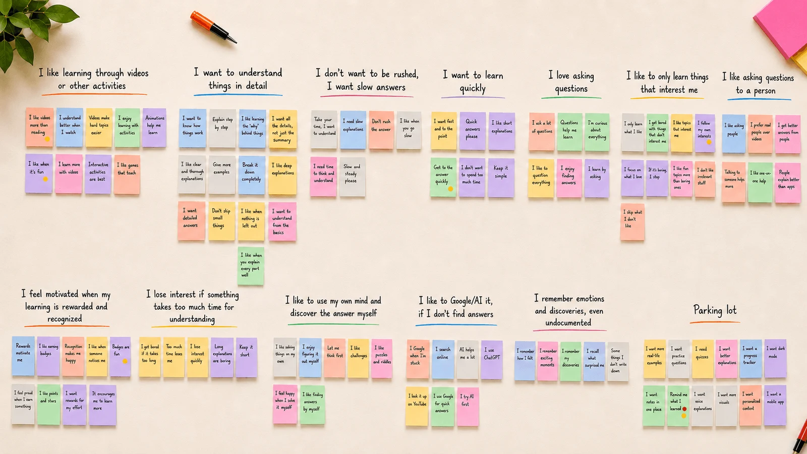
A child might have a question in the car, at lunch or just before bed. Our interviews with seven kids and five parents explored what happens to those questions, and how differently children like to learn. Some wanted quick explanations; others wanted details, stories or quizzes. We explored voice input, layered answers and a place to save discoveries. Then we put the concept in front of four kids. Two interactions we thought were clear turned out to be stumbling blocks.
Interview themes from the research
What testing changed · 01
Let kids see that Whylo is listening.
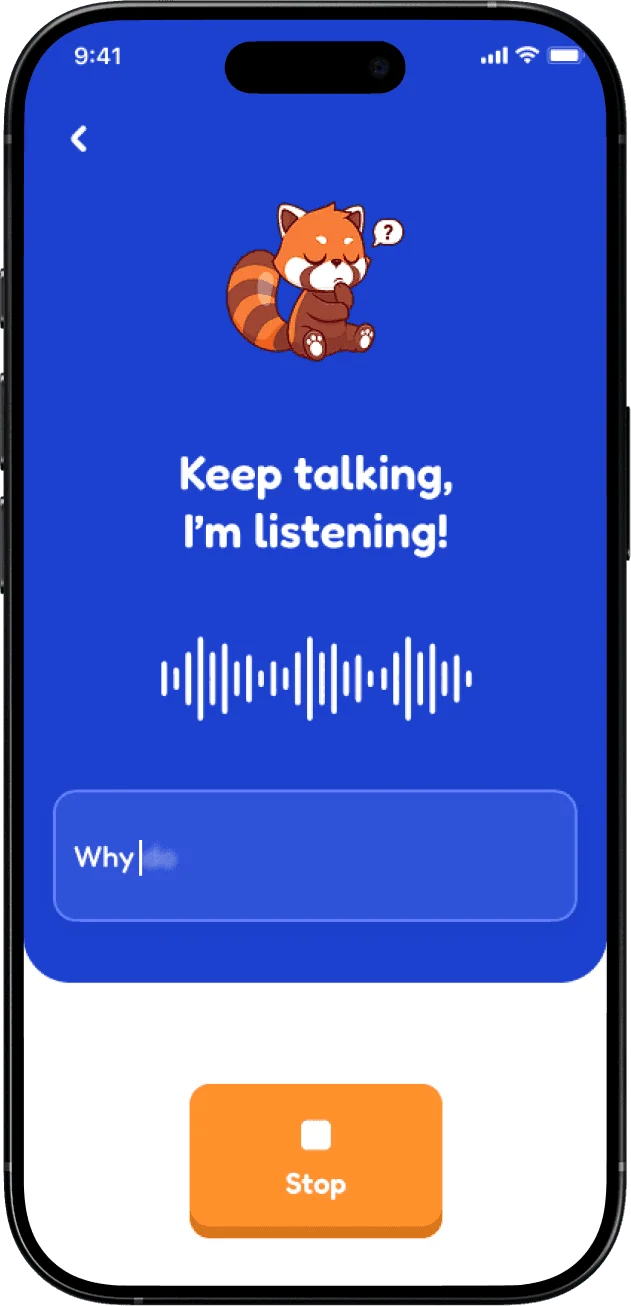
The waveform moved, so we assumed it explained that the app was listening. One tester wasn't so sure.
“I did not know it was listening. It felt like nothing was happening.”
The waveform made sense to us, but one tester couldn’t tell whether the microphone was on. We replaced ambiguous listening feedback with live transcription, so their own words confirm that the app heard them.
Before
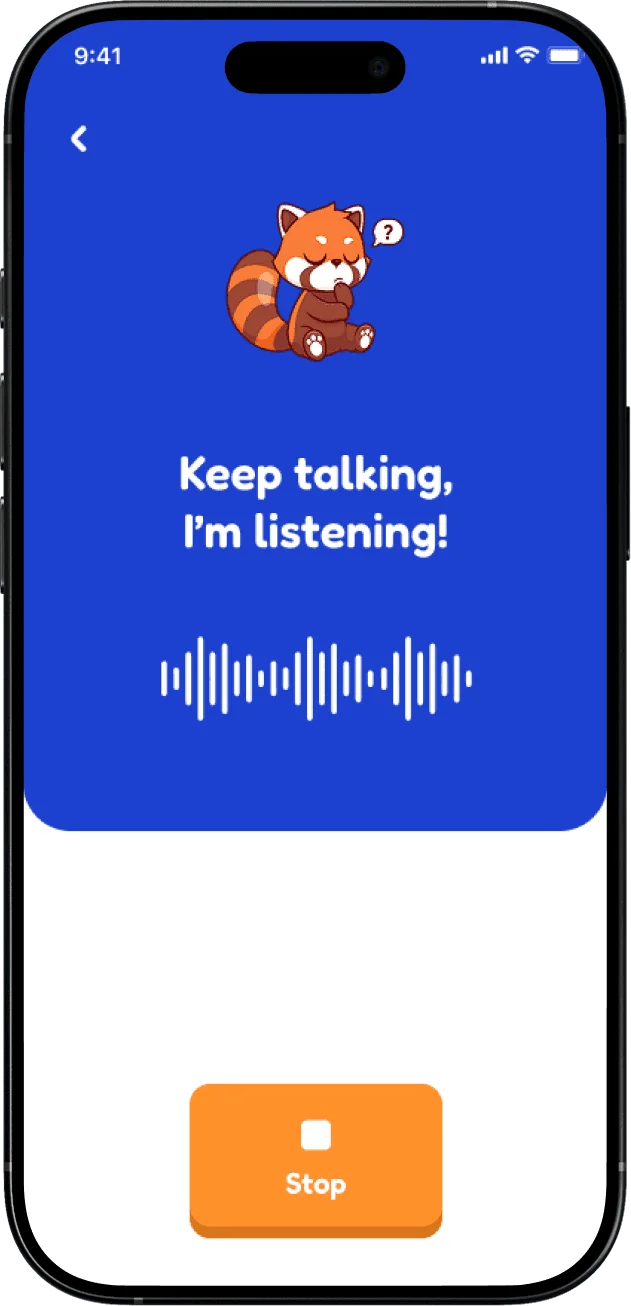
After
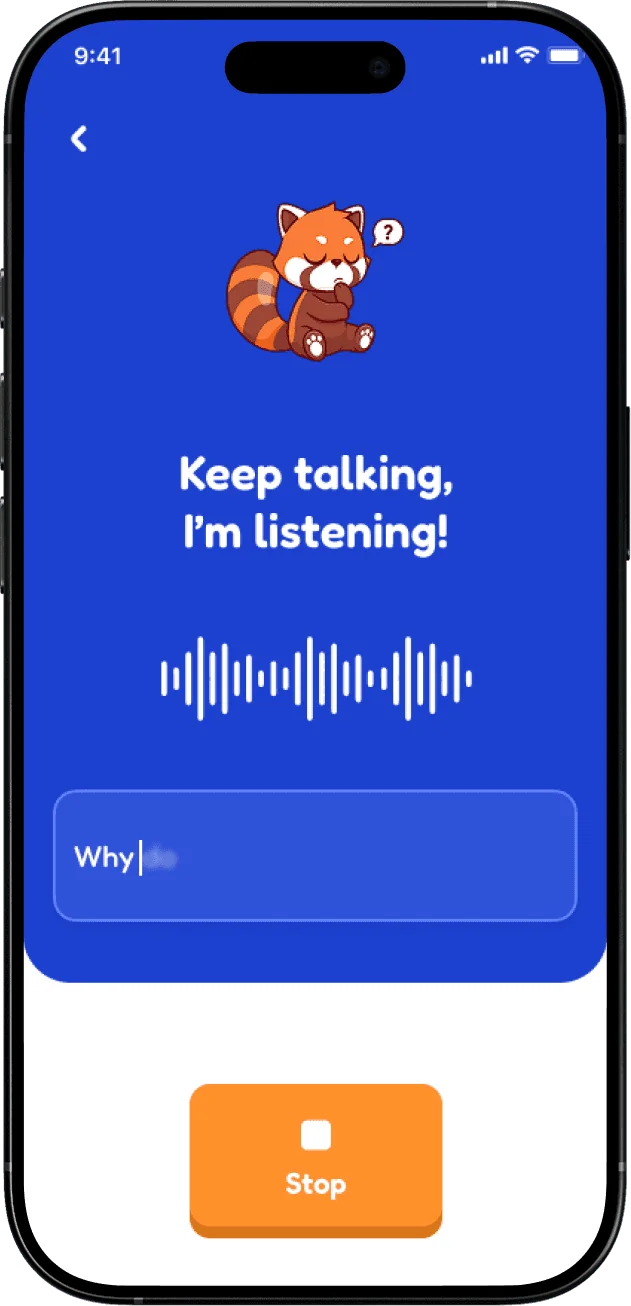
What testing changed · 02
Take the homework out of remembering.
Saving an interesting discovery seemed like a good idea. Asking children to write a reflection turned it into a chore.
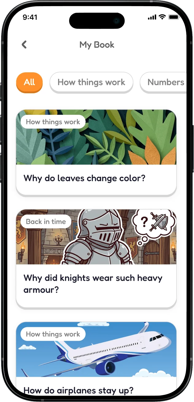
An open-ended reflection prompt felt like schoolwork to a younger tester. We removed it and simplified My Book into saved discoveries kids can return to without being asked to write an entry.
Before
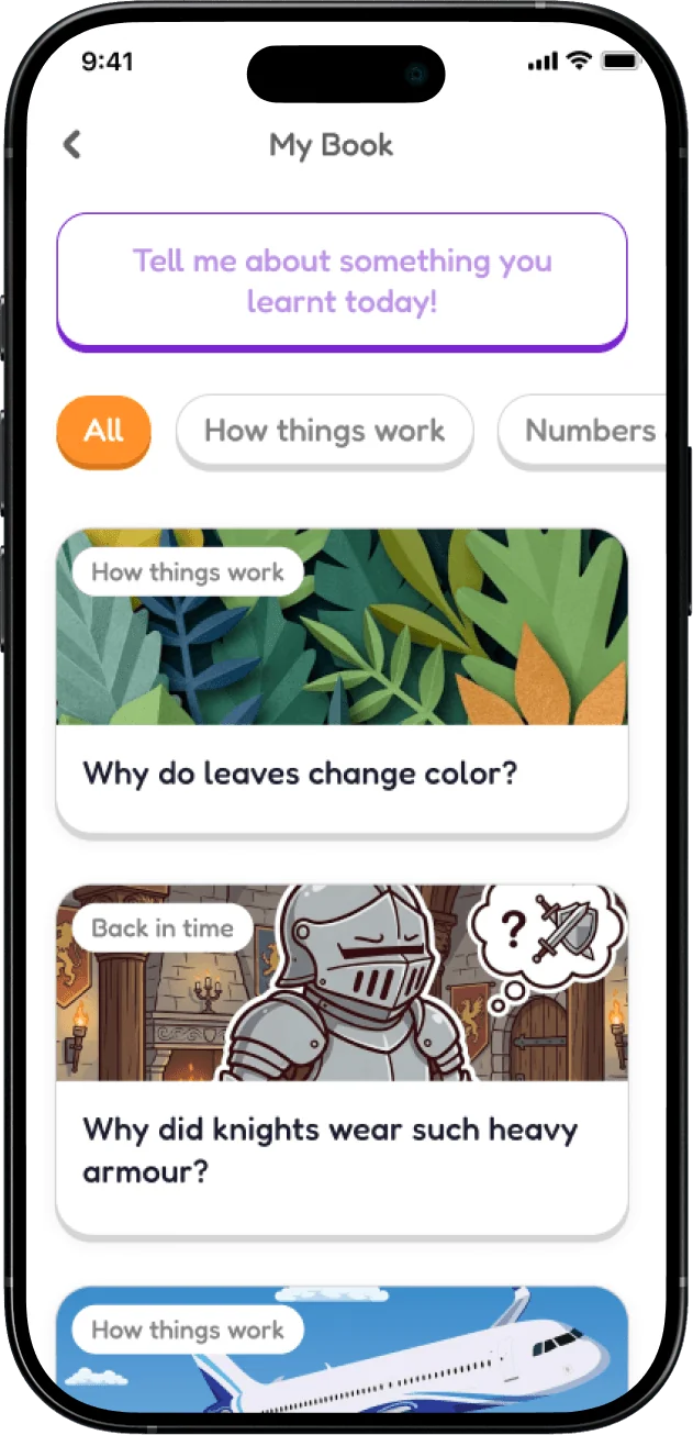
After
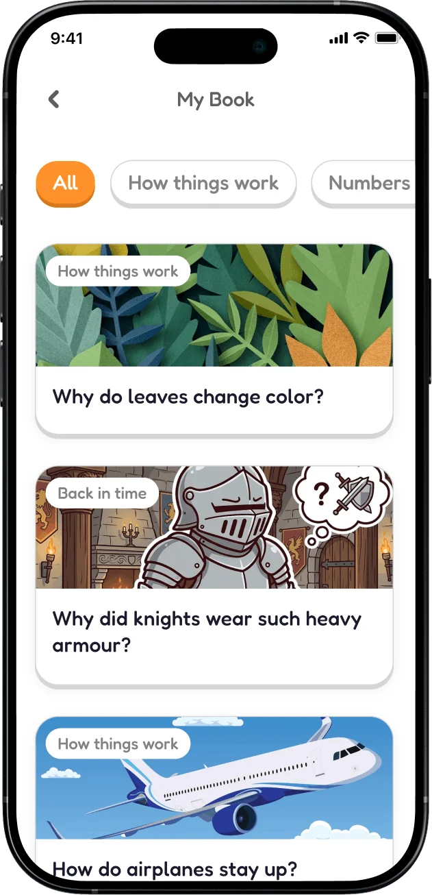
From research to interaction · 03
Make room for both quick answers and deeper curiosity.
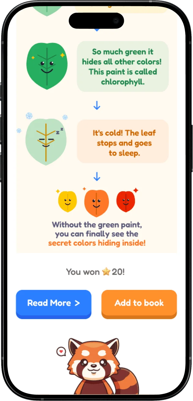
Making answers short would help some kids move on, but others wanted to keep exploring. How could the same interaction serve both?
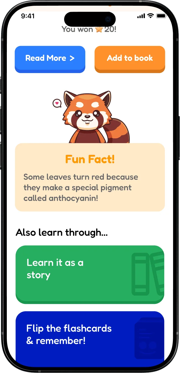
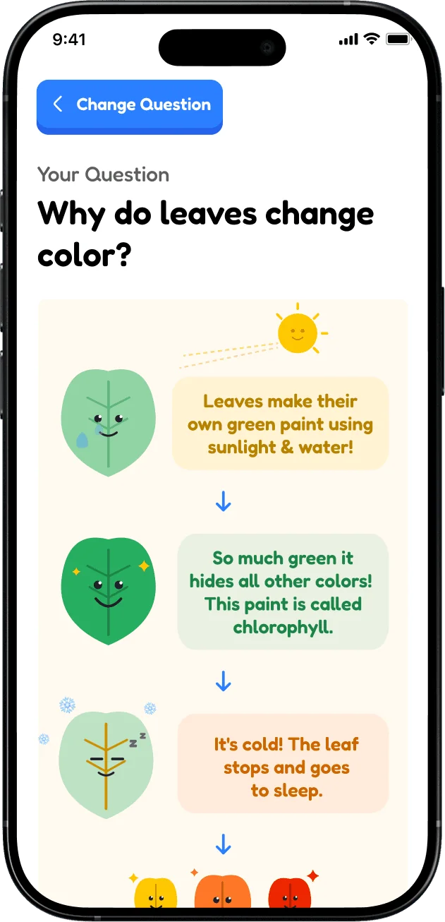
Interviews revealed different learning preferences. Some kids wanted a quick explanation; others wanted stories and detail. Two-level answers let them choose how far to explore.
The answer experience
The actual work
The screens, together
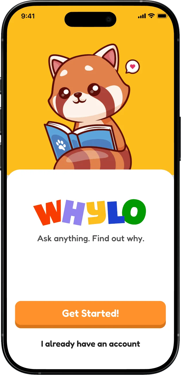
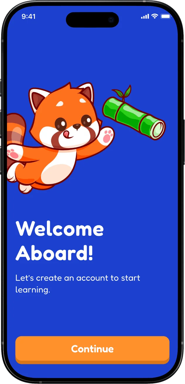
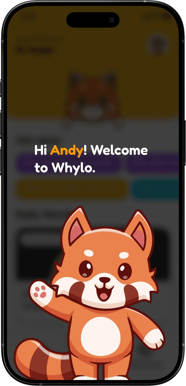
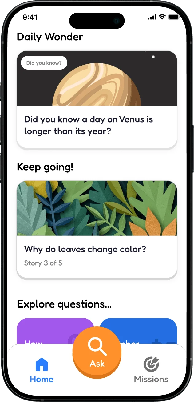
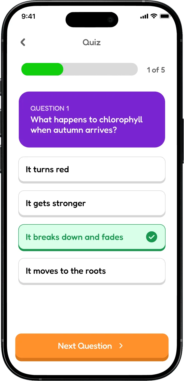
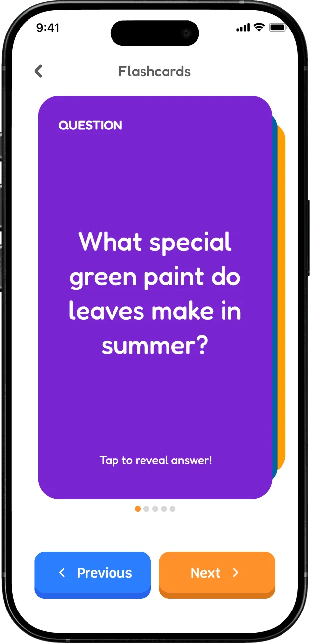
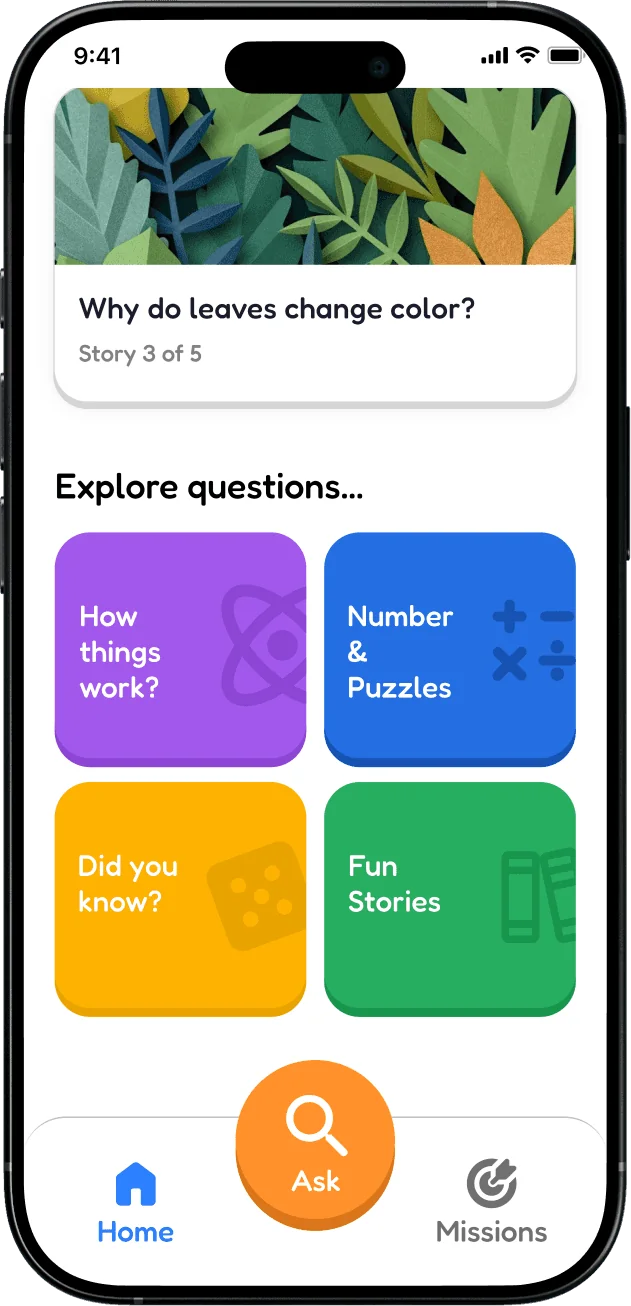
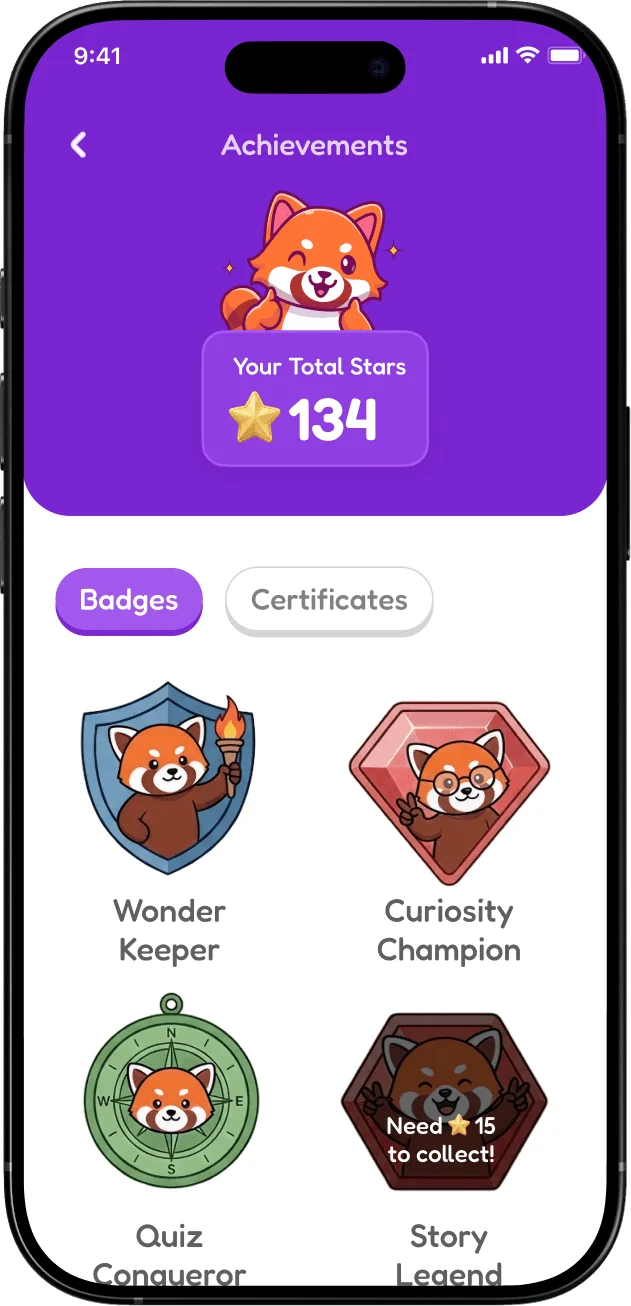
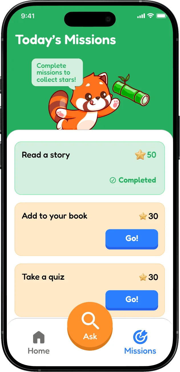
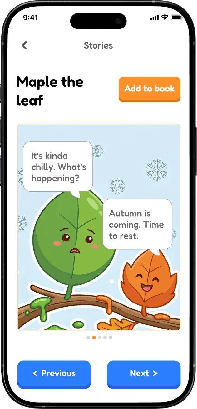
The complete concept, from first use to asking questions, saving discoveries, quizzes and stories.
Where the work stands
The testing led to clearer microphone feedback and a less demanding way to save discoveries. These are changes to the concept screens; the revised flows still need another round of testing. Answer accuracy and age-appropriate safeguards would also need validation before launch.
Looking back
What I'd test next
I'd bring the revised listening and My Book flows back to kids, particularly across the wide age range we interviewed, and observe whether the changes work without prompting. I'd also want to test how often kids return to saved discoveries. Before anything could launch, answer accuracy, age-appropriate content and parent safeguards need proper attention. An interface can look friendly and still be unclear to the person using it.