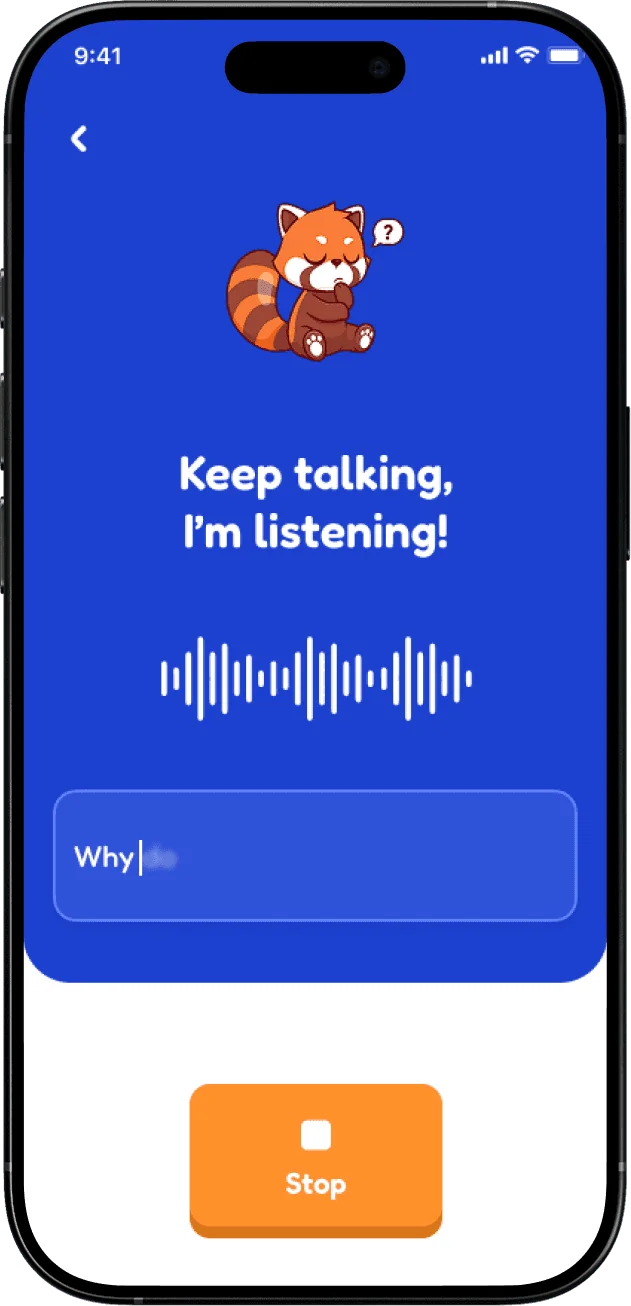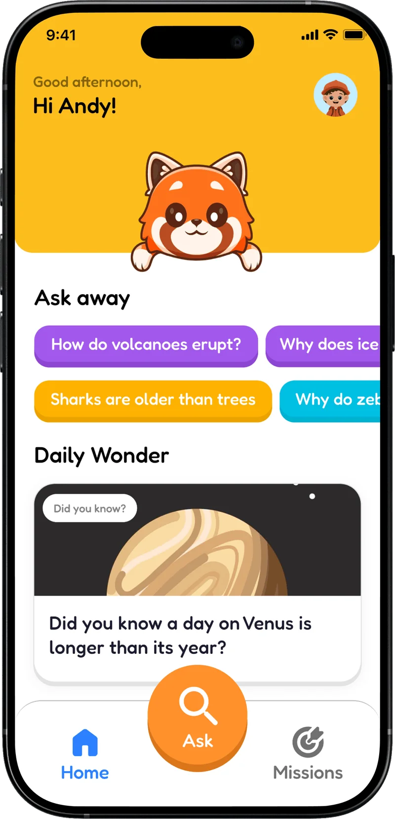
The story at a glance
Hospital auditors needed a clearer next step, not another feature.
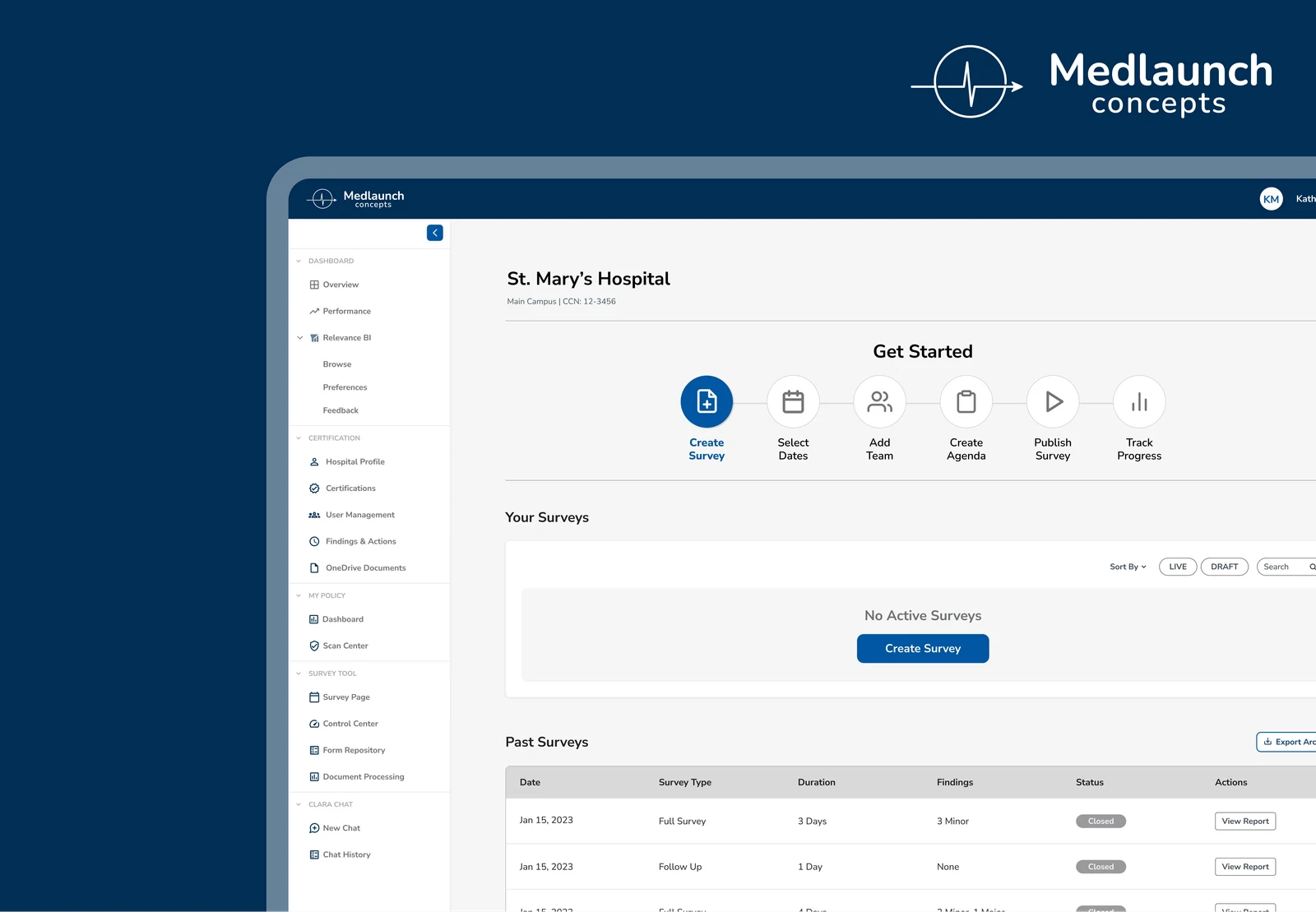
On a four-person team working with MedLaunch, we evaluated its Surveyor Tool for hospital accreditation audits. Observed tasks included starting surveys, organizing agendas, rescheduling and publishing findings.
UX research and redesign proposal · Healthcare audit workflows
- 4
- people on the research team
- Surveyor Tool
- audit workflow evaluated
How we got here
The workflow wasn't giving surveyors a clear next step
Hospital compliance audits involve creating surveys, planning across days, moving between departments, recording findings and preparing submissions. In our four-person project with MedLaunch, we watched participants attempt setup, agenda management, rescheduling and publishing tasks. Several hesitated at the start, lost planning context or had to double-check their progress. Instead of introducing more features, we proposed clearer starting points and a more predictable progression through the work.
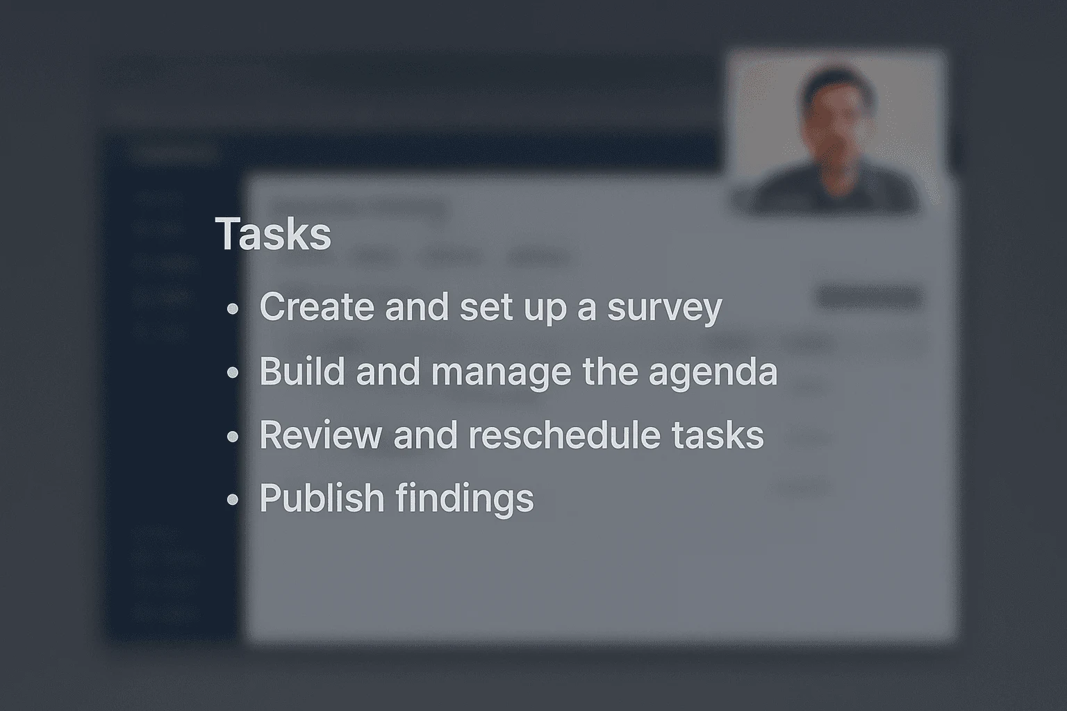
Tasks observed during the evaluation
Starting the work · 01
Make the first action unmistakable.
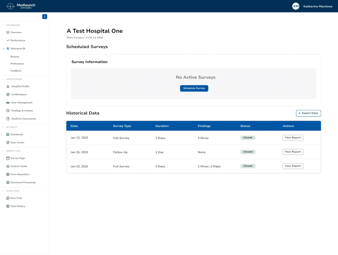
The controls needed to start a survey were present, yet users still hesitated over how to begin.
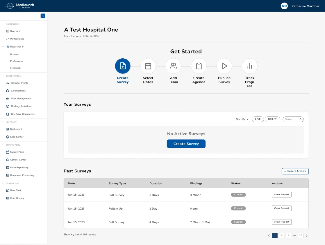
Participants hesitated when the survey-creation screen didn’t clarify how to begin. We proposed a guided entry point with a clear primary action and visible progress.
Before
Proposed redesign
Keeping context visible · 02
Planning shouldn’t depend on memory.
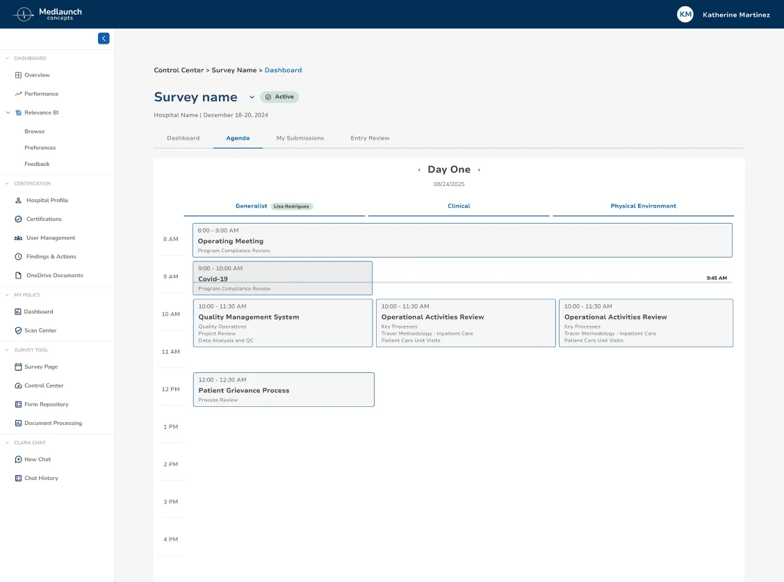
An audit can run across multiple days, but the original planning experience made people work through one day at a time.
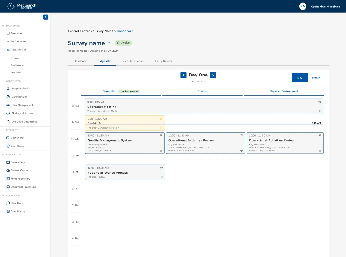
Day-by-day planning made it difficult to maintain context. The proposal introduced clearer planning controls and a Day/Month switch; the full multi-day workflow is not represented in the current screen.
Before
Proposed planning screen
Closing the loop · 03
Bring documentation and submission into focus.
Documentation was available, but split review and submission controls added decisions at the end of a demanding workflow.
Splitting review and submission across controls created extra decisions. We consolidated the documentation flow into a more focused place to complete the task.
Before
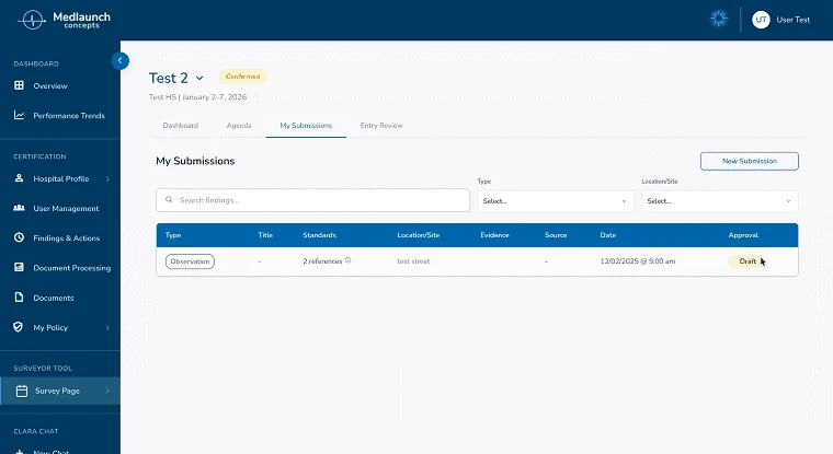
Proposed redesign
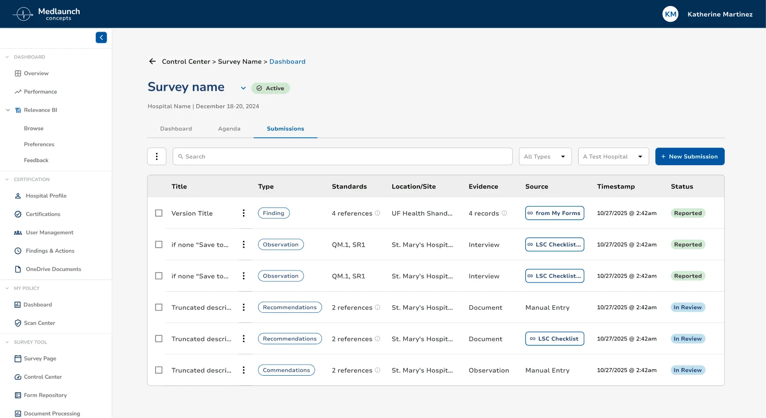
The actual work
What we tested
The tasks used to examine the original Surveyor Tool.
Where the work stands
The result is a usability-informed redesign proposal, not an implemented or validated workflow. A follow-up test should check whether surveyors can start, reschedule and submit findings without the earlier workarounds.
Looking back
Where I'd take the work next
The proposal wasn't implemented or retested, so the redesigned screens are a hypothesis about a better workflow. I'd test them with surveyors in a realistic multi-day scenario, including rescheduling and incomplete documentation, to see whether they can recover without losing context. The project reinforced how important the first and last steps of an experience are, especially when the work around the interface is already complicated.