The story at a glance
Seeing a loan balance isn’t the same as understanding what comes next.
This mobile concept explored how borrowers understand repayment. We interviewed borrowers in the U.S. and India, observed an existing loan portal, and carried out three moderated usability tests on the design.
Interaction design and usability testing · Concept for student-loan repayment
- 2
- country contexts
- 3
- moderated usability tests
How we got here
The numbers were available. Understanding them was harder.
We began with a broad debt-visualization assignment and focused it on student loans. Interviews with borrowers in the U.S. and India, plus an observation of an existing loan portal, pointed to difficulties with interest, repayment timelines and knowing what to do with the information on screen. We created a mobile concept around repayment breakdowns, comparisons, budgeting and plain-language resources. Three moderated usability sessions helped us see where that clarity still broke down.
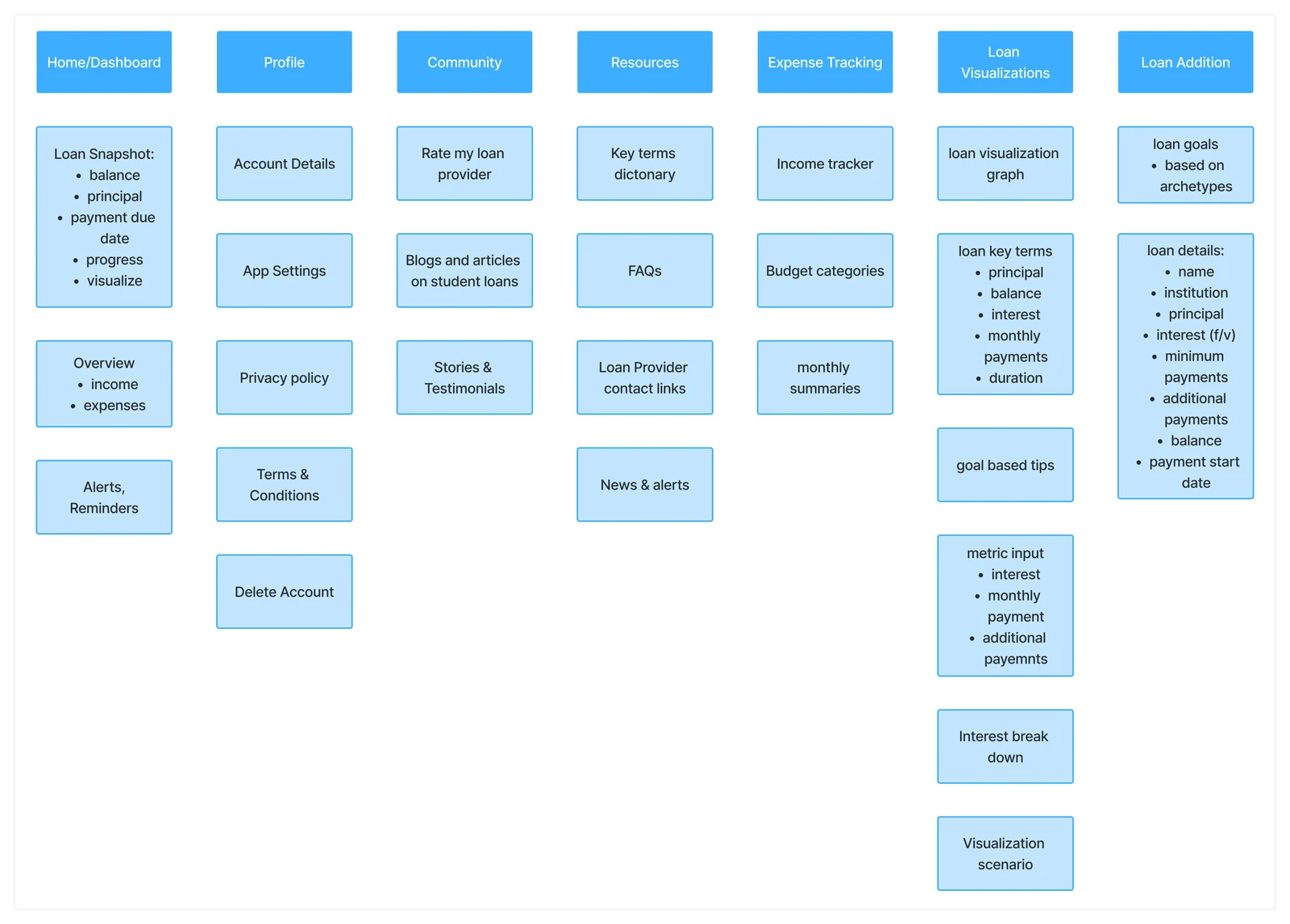
Organizing the borrower's journey
Testing the explanation · 01
A chart can look clear and still be read incorrectly.
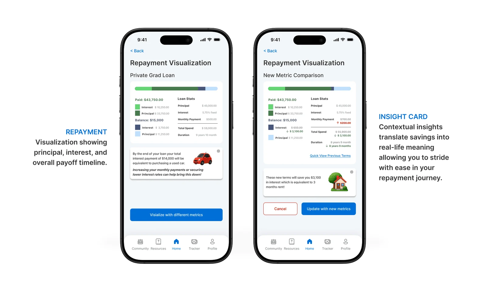
The repayment visualization looked calm and readable, but testers misread the color labels for important numbers.
Testers misinterpreted color labels in the repayment visualization. That pointed to the need for clearer labels and explanations alongside the numbers, rather than relying on color alone.
Repayment visualization concept
Reducing the reading burden · 02
A dictionary isn’t helpful if it feels like more homework.
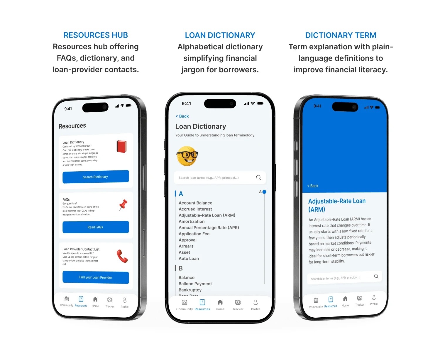
We added a dictionary to make the language more accessible. Some participants found the dictionary itself overwhelming.
Participants found the loan dictionary dense. The proposed response was to add short explanations closer to the decisions borrowers were trying to make.
Financial language and resources
Choosing what to remove · 03
Trust mattered more than a community feature.
A community feature sounded supportive in planning. During testing, privacy and trust became bigger concerns.
The community concept raised privacy and trust concerns in testing. We removed it from the proposed scope instead of making users share sensitive experiences to get support.
The actual work
The mobile experience
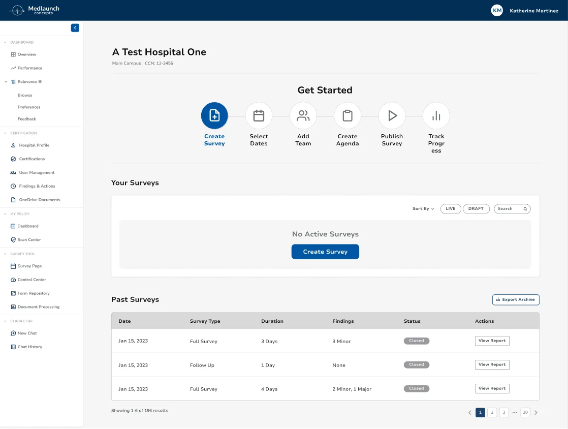
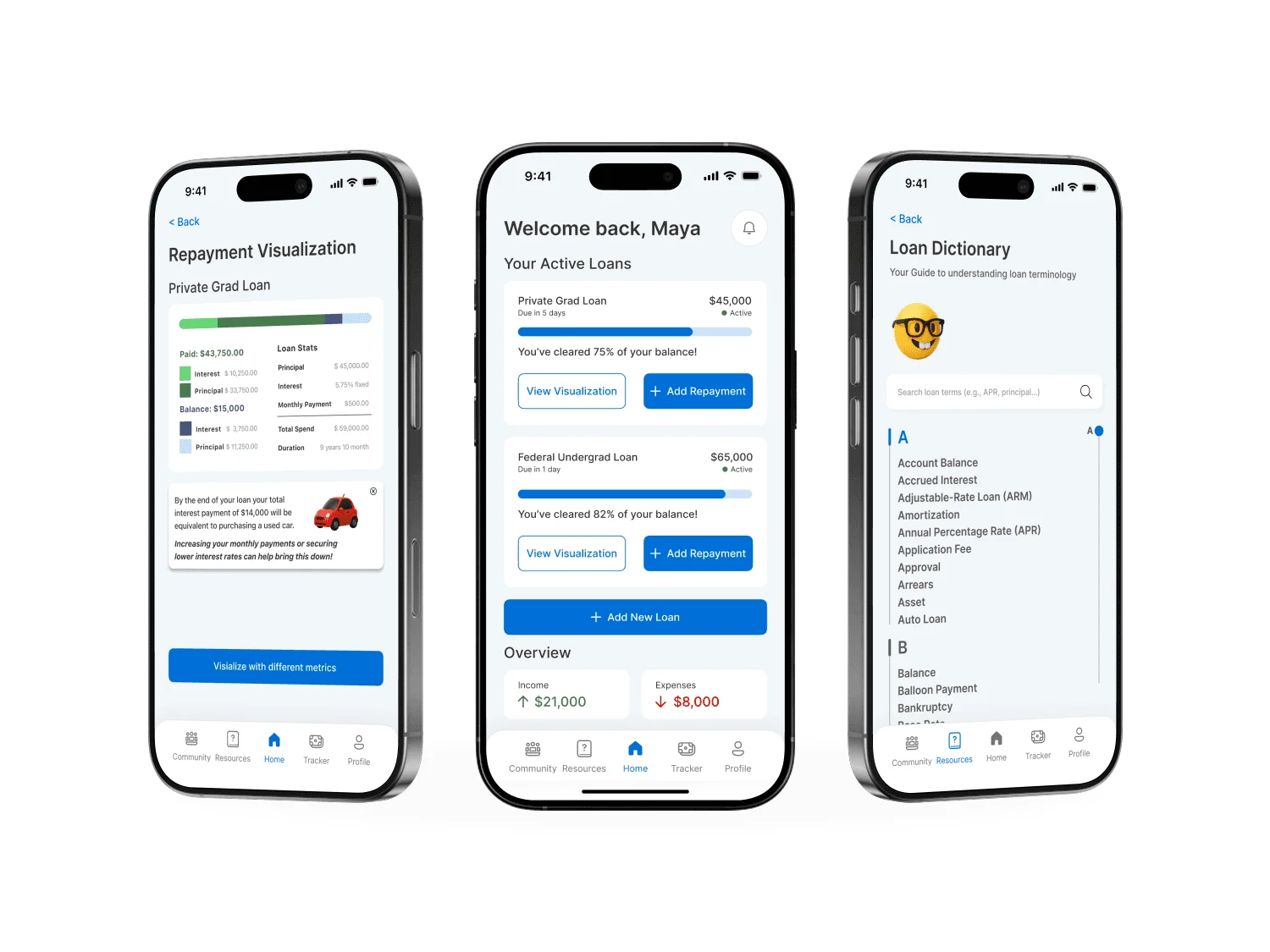
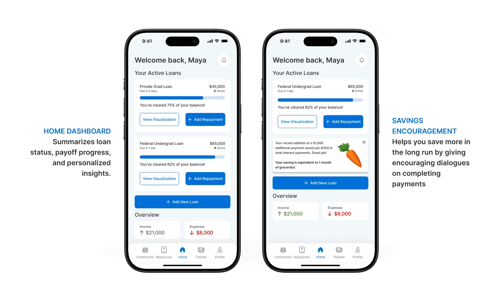
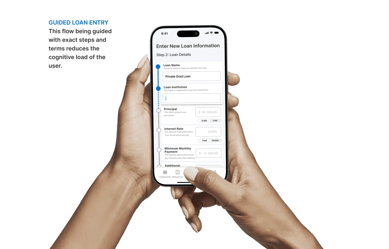
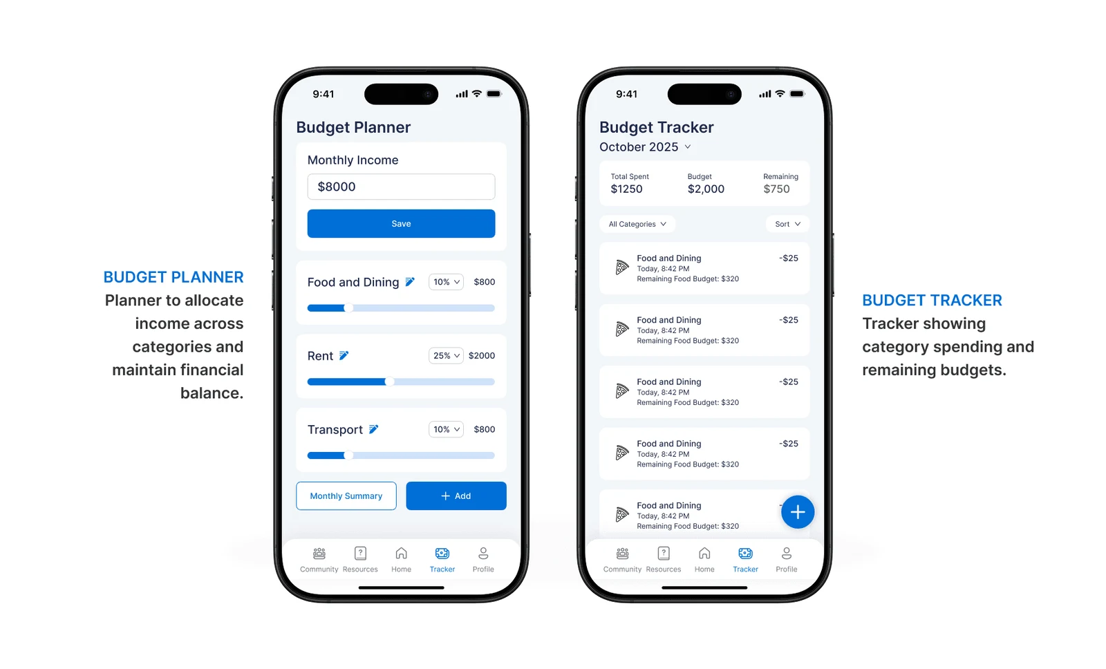
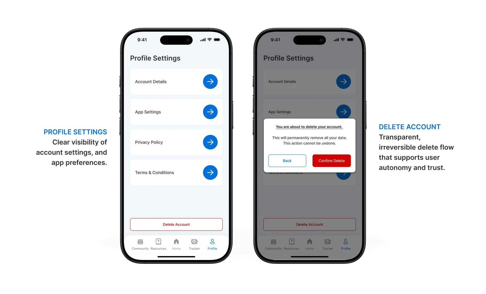
The existing concept screens, including the dashboard, repayment breakdown, budget tools and settings. Some still represent an earlier iteration.
Where the work stands
Three sessions informed the revised direction, but we haven’t retested those revisions. Some concept screens still show the earlier Community navigation, and the example repayment calculations need verification before this could be developed as a financial tool.
Looking back
Clarity has to be tested, not assumed
I'd start by checking the example repayment calculations and deciding which country's loan rules the final concept should support. Then I'd update screens that still show Community and retest whether borrowers understand the revised labels and comparisons. The three usability sessions informed the proposed changes, but they didn't prove the design reduced anxiety or improved financial decisions. That difference matters in a finance project.