The story at a glance
Making things consistent shouldn’t erase what makes them useful.
Our four-person team built Umami, a design system concept for Weee!, by auditing publicly available screens. The question was which patterns to standardize and which differences actually served the product.
My contributions: typography, naming, token structure, carousels and category cards · External concept, not a Weee! implementation
- 3 weeks
- public interface audit
- 5
- type roles consolidated
- 159
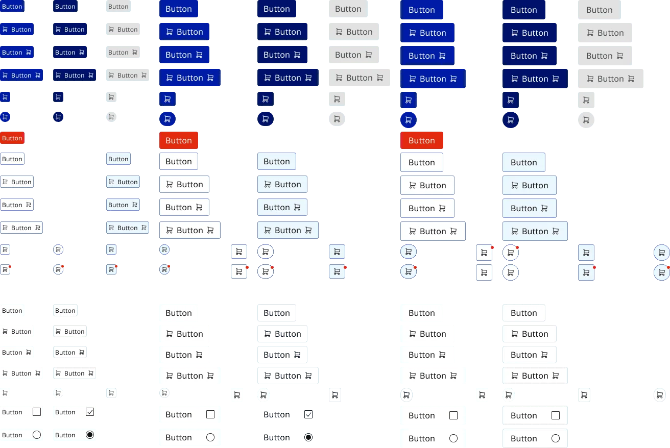
- concept button variants
How we got here
Before building a system, we took the product apart
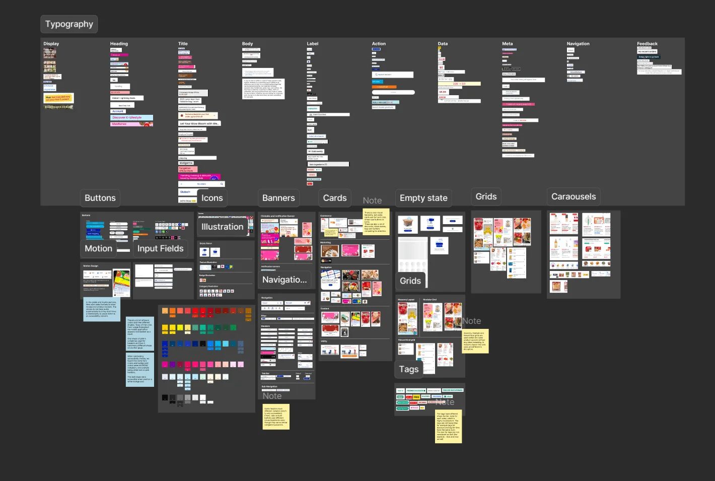
We couldn't see Weee!'s internal design system, so our four-person team audited the public app for three weeks. We compared typography, colors, grids, cards and navigation across its different storefronts. Some patterns repeated almost exactly; others changed with their shopping context. My work centered on typography, naming, token structure excluding colors, and carousel and category-card components. The challenge was deciding which differences were inconsistencies and which ones the system actually needed.
Comparing observed UI patterns across the app
A design judgment · 01
Ten typography roles became five, not one.
The audit showed ten typography roles. Simply keeping all ten would preserve complexity; reducing everything to a few arbitrary styles could lose important hierarchy.
The audit surfaced ten observed roles. I led the consolidation into Display, Heading, Body, Label and Price, using tiers and weights rather than stripping away meaningful differences. The detailed study includes the role inventory and type scale.
Starting from the existing interface
A system decision · 02
Reuse the carousel structure, not every exact layout.
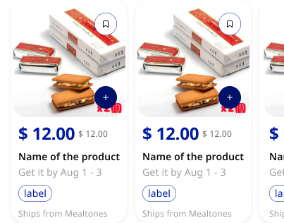
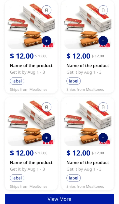
The same family of carousel patterns served different surfaces. Copying each variation would be easy now, but harder to maintain later.
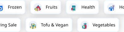
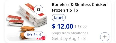
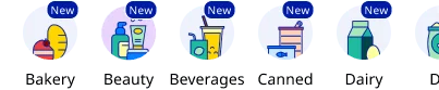
Product surfaces needed different arrangements, but not entirely separate architectures. I worked on carousels and category cards with composable variants and slots so content and layout could vary without rebuilding the shell.
One of the carousel patterns
Making it findable · 03
A library is only useful if someone can navigate it.
A large component library can look impressive in Figma and still leave a new designer searching for the right element.
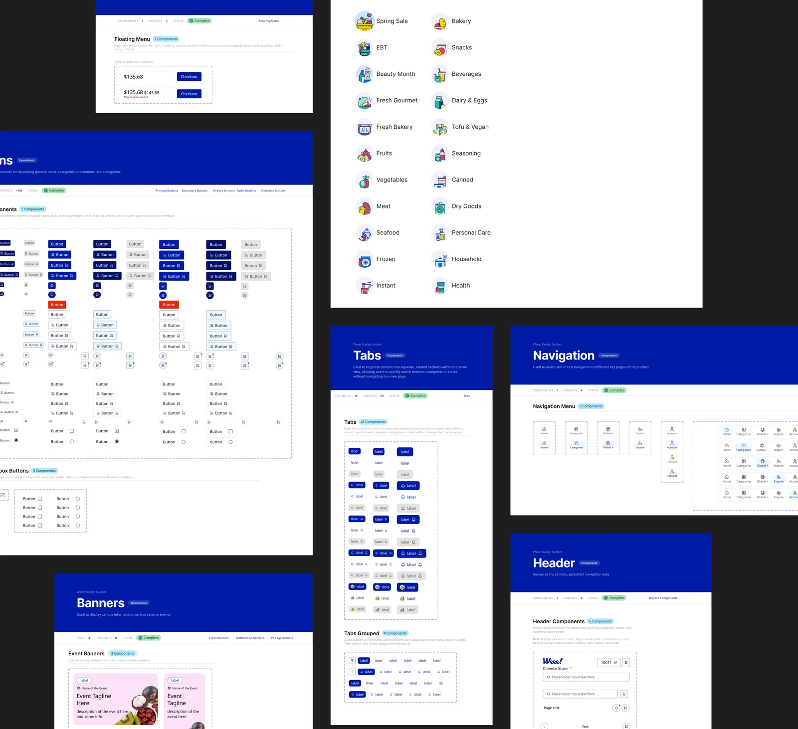
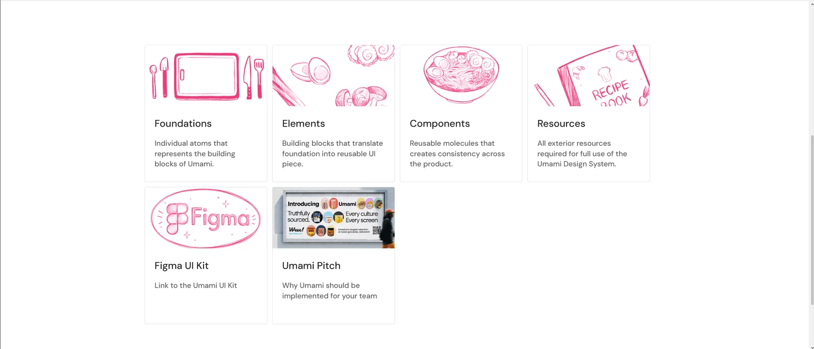
I helped define token structure and a naming convention based on slash notation and property-value pairs. Documentation in Figma and Zeroheight brings the components, states and usage guidance into one system.
Documentation structure
The actual work
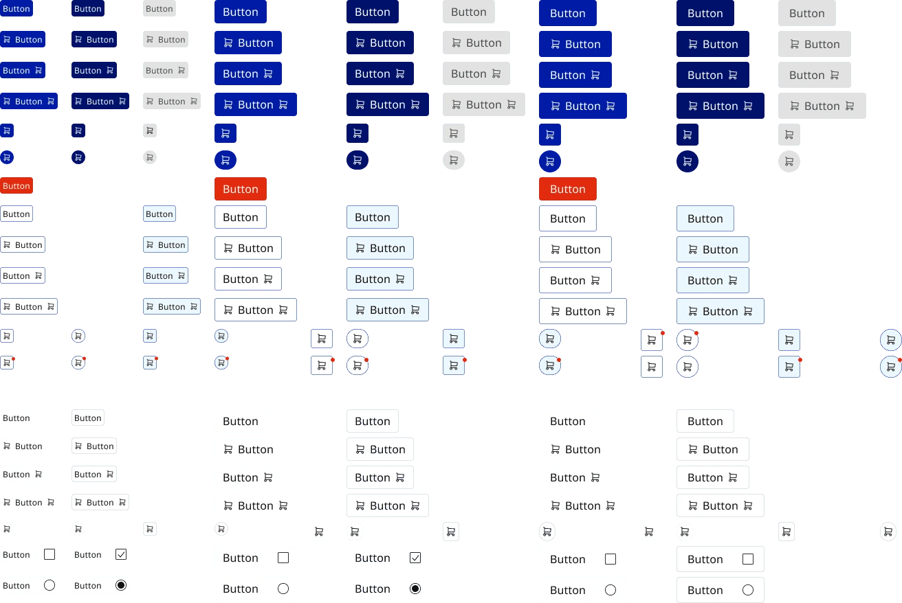
The component library
Button states, reusable layouts and carousel variations from the final concept.

The foundations
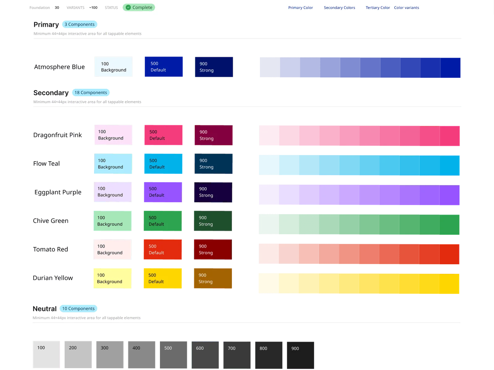
The color system supporting the component work.
The library and its documentation
The Figma system and Zeroheight documentation as delivered in the concept.
Where the work stands
The concept library includes five color families, 60 type styles and 159 button variants. Those numbers describe what we created, not production adoption or faster development. A useful next test would be asking another designer to build from the library without our guidance.
Looking back
What I'd do earlier next time
I would lock down the naming and documentation conventions before so many components were built. We made some of those choices later, which meant going back to rename things. The system is a concept library, not something Weee! adopted, so the next useful test would be asking another designer to build a screen with it. Counts of styles and variants tell you what we produced, not how easily someone can use it.